
Hey there, ladies!
You know how much I love a good journal – I have them all over the house! I mean, you never know when inspiration may hit! Well, we are working away at creating a new journal and would love your input.
If you were to purchase a journal, which design direction speaks to you the most? We’d love to base the new journal cover on the community fav!
Cast your vote by sharing in the comments section!
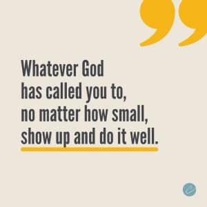
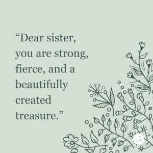
Do you like Graphic #1 or Graphic #2 better?!?!
Responses
My vote is #2 , no question. Strong, fierce, a beautiful treasure…..that is a good t-shirt too!!!
Yessss…agreed it would make a nice tshirt.
I agree!
Yes, #2 is a good t-shirt ??
Graphic #2
My vote is #1
#1!
My vote is #1.
# 2
# 1 could go inside great reminder for how we show up in the world.
2
2
1 and I’d wear it on a tshirt 😉
Graphic 1! So hard to choose!
Graphic #1
#2 I love the nature. The calmly look attach me.
My vote is #2
#1 …but I love the plants on #2
My vote is #2
Graphic #1
Our ministry is not for us but for others. We want to show up and do the thing for someone else. We are called to be a light to the lost so no matter how small your role, show up and do it well❤️!
Definitely numer #1 for me. Makes me feel like its time for business ?
#1 is resonating for me in this season… 😉
#2 is also nice and would make a great t-shirt as suggested! Great job!
My choice is #1
I’m feeling graphic 1??
My vote is #2 because it is a great affirmation for me in this season. And I agree it would make a great t-shirt.
Graphic #1
Graphic #2
Graphic #2!!!
Graphic #1
I vote on #2
Its a journal. #2 It’s speaks serenity and set a tone to write something #1 preaches I’m not doing an open sermon.
#1
#2
My vote is #2 and I agree a Tee Shirt would be awesome
Graphic # 2
I Vite graphic #1
Vote
Graphic #1
#1
Hi Ladies…..I really like both. But, having to choose. I would choose #2
Have a Blessed Day and Weekend!!
Thanks,
Adrian
1
#1!
#2 for a journal
#1 for the post cards you send out
It has to be 1 for me. The message is clear and direct ?
#2 like this one the best?
#1
My vote is for #1! It’s a reminder that no matter the significance of what I’m called to do that I show up and do it well!
I like #1. Alternatively, the copy of #2 but with the design of #1.
Graphic 1
Graphic 2 would be good on a T-Shirt
I choose #1
My vote is for #2.
Graphic #1
#1
#1
#1 powerful sentences ??
1…the yellow matches with the SC color scheme
Graphic 1
#1
#1
From a Business perspective I say number 2! Because it can be sold in Christ held events and in the common world. So times you need that open door to share the gospel. Number 2 will give you that chance.
Plus with number2 two you are No limited to one group of people you can sell it anywhere.
Graphic 2!
My vote is #1.
Y’all, all of the responses are amazing!
My vote is for #2 because it feels a bit more calming and inviting into the journal/calendar space. I’m envisioning myself with my coffee, on the back porch, watching the sunrise, ready and accepted as I am.
(Talk about extra!!! ?)
Love you all!!!!
#2, a great reminder so we know we are equipped for what is happening in life!
#1 challenges me
#2 affirms me
I vote for #1 – I need the challenge
#1, and yes on a T-shirt!
#2
Graphic #2. Strong, Fierce, Beautiful Treasure … something I’m tell my 3 grand girls!
My vote is #1
My vote is for graphics #2.
I like graphic #1’s wording with graphic #2’s color and floral decor background.
My vote is for #1.
Graphic #1
I like #2.
Both!! Use one for the front cover and one for the back cover…???
1
I’ve already voted. Having said that – I agree with the t-shirt idea for option #2, as well as a coffee cup, notepad, banner, stationary, etc, etc!!! ??
#1
My vote goes to #2. The calmness of the graphics draws me and the words are a great reminder.
2
I like Graphic 2!!
Graphic #1
I like graphic #2 for a personal journal. But I want both of them on a tshirt. 🙂
#1 for the cover and perhaps use #2 as a subdivider as a mid-year encouragement.
This is a good idea.
#1 – It’s all about the plan he birthed on us – we must be good stewarts of His vision!
#1
Graphic #1
#2, I like the graphics and the colors.
#2
#1
#1 I was drawn in by the colors, font size, and the underlined word! The graphics are definitely giving life!
Agreed…makes me want to open up and write ✍?
Graphic #2 for sure!
Graphic 1
#2
#1 & #2 I love both…can we have both?
Graphic #2. Strong, affirming statement: yet, calm to my brain. #1 feels like I’m sitting in a harshly lit room.
I vote for #1! I think this is a place where we should all strive to be, where we always show up and always do our best.
They’re both beautiful, however, I vote for #2.
#2 is my favorite. I love it!
My vote is #2
My vote is # 2
I like Graphic #2. It is one of my daily affirmations. I am treasured, cherished and loved by God!
#2 is dainty yet powerful!
#2 for journal
#1 for mug
#1 reminds me of Colossians 3:23: “whatever you do in word or deed, do it heartily as to the Lord, not to men”
#2 would be nice on a t-shirt or back cover of journal
Graphic #1 – very “on brand”
Agreed
My vote is for #2!
Graphic #1
I vote for #2. Affirmations and encouragement
2
I like #1- fantastic reminder!
Can you vote even if you’re not getting a journal?
#1 looks like the usual style of Team CEH but #2 looks a bit different. It may be the “Dear sister” that got me and I like the flowers. Why can’t it be both though?
My vote is #2
Graphic 1
i vote number #1, it’s a good reminder to never quit and keep things in perspective!
Graphic #2 is my vote.
Both are great, but my vote is #2.
I appreciate the look of #2 (softer; provides a sense of calm), but choose #1! ?. Thanks for asking!!
#1
Gaphic 1✨️??✨️
Vote #1
I love them both for different reasons… but my favorite is # 1
#2
Love graphic #2!!! But those words in graphic #1 are speaking to me!
Graphic 2
Received gentle pressure to choose #1, but I prefer #2. (Both are lovely) How’s that for diplomacy? ?
#2
#1
I vote for Graphic 1 because I love the wording more. I like the design more on Graphic 2. My vote is Graphic 1.
I vote for Graphic #2 although I like both!
like them both but graphic #1 is more your brand.
My vote 2
I vote #2
My vote is for #1 but #2 would make a great t-shirt
#2
#1
My vote is #1
Graphic #2
My vote is for option 2
My vote is for Graphic #2
Graphic #2
It has a personal touch as well as it is easy on the eyes.
My vote is #1, but I’d like to have both: #1 on the outside and #2 on the inner cover, first page or back cover.
#1
My vote is #2 for a journal, calendar, or a t-shirt. The first one is good also.
Graphic #2
Both are great, empowering…but #1 is a CALL TO ACTION! ✍️ ??♀️ ??♀️ ??♀️
#2
I like the graphic of #2 and the words of #1.?
#1
My vote is for graphic #1
Quote of image #2 with the graphics of #1
I like them both but would go for number 1 as my first choice
Both are equally beautiful and timely. For me #1 is speaking to the voice in my head: “If you know what you are to do and you aren’t doing it……it is sin!”
My vote is #1.
#2
#2
Graphic #1 for me. The vibrant color and bold print stand out more. As for what it says that really speaks to me. I would definitely purchase for myself and purchase to gift to others.
The flowers on #2 speak well for me
Absolutely #1
Graphic #1
I like # 1. I think it keeps one focused on the mission at hand and to stay on God’s Plan for your life.
Graphic #2
Graphic #1.
I vote Graphic #1. It reminds me to do it and do it well. Do not waste time.
Graphic #1
I vote for #1
#1
Both speak to me. Love them both, but if I absolutely had to choose just one, it would be graphic #2. Thanks for including us in the selection process.✨?
Graphic #2 definitely!! And I agree, that would also make a fabulous t-shirt!
Graphic #1
I like the both but Graphic #1 gets my vote.
Graphic #1
Vote 1
#1
Graphic 2, it’s calming.
Graphic #1
#1
2
Graphic # 2. It is strong and clear about the message but is yet soft and feminine. Its beautiful.
I love them both! I ready #2 and thought that would be good to send to a friend. Then I read #1 and yeah, #1 is definitely for me. Everyday we are called to do something well. Even if it’s just laying in bed and being in his presence when our bodies want to jump up and check the calendar. I would definitely say #1111111111
Maybe you can create little note cards with graphic #2 on it as a bonus buy or something that goes with the calendar that we can send out to a friend that we may be thinking of when writing in our journal.
That’s for women like me who get side tracked doing one thing and think of doing another at the same time, so the note cards would help lol.
My vote is #1 hold me accountable
Number 1